Friday, 22 February 2013

Someone been naughty!

And very very busy.

Unfortunately  I've been so busy, I've kind of forgotten a bit about my blog.
But I will do a post soon.

Hurrah!

Friday, 18 January 2013

What does Saint Sebastian have to do with graphics?!

Well first a little history...

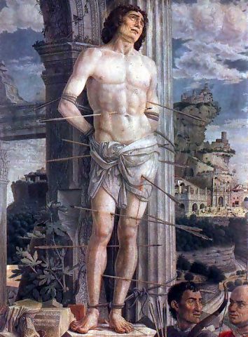
Saint Sebastian is a Christian Saint who was tied to a post and shot with arrows and then clubbed to death for converting people to Christianity in the Roman Empire.
All in all, a pretty sad story. 
Saint Sebastian has also been depicted by many artists...
Perugino, San Sebastiano, 1495
File:Sebastia.jpg
St. Sebastian, Andrea Mantegna, 1480

And yes, these are both very beautiful, but what do they have to do with Graphic I hear you cry...

Well a 1968 cover of Esquire is the answer to that.
Carl Fischer, The Passion of Muhammad Ali, Esquire cover, 1968
The Passion of Muhammad Ali, Esquire cover, 1968

This cover was designed by George Lois - an American design who has designed over 92 Esquire magazine covers. Taking inspiration from popular culture, films, modern and classic art as depicted here.
His reference to Saint Sebastian make Muhammad Ali Saint-like. The design is powerful and slightly humorous.

So there, here is a wonderful example of how to take a classical painting and make it relevant to modern day. How wonderful.. 


Thursday, 17 January 2013

David Carson - the man who brought us Grunge Typography.

David Carson...

Is an American graphic designer who is best known for his innovative magazine designs and awesome experimental typography. He also was the art director for the magazine Ray Gun - of the 'rock-and-roll alternative genre. 

His style is pretty stand out, with different fonts, size and colours used to create a piece, including overlaying text. A great example of this is the Obama cover for G2:
 
The colours are bold, the idea is simple and its overall looks great.  With only 3 words and 2 letters he is able to show the entire campaign of Obama and then the text in Sans Serif - making it free and without restraint of traditions, showing a new era for American politics.

With his simple yet powerful designs, I hope to take this style to create some piece of my own in graphics - seeing how little you need to say to mean something big. 

Wednesday, 16 January 2013

Blood is thinker than water...

Blood is thicker than water...

This is a proverb I used in my project. I then took a series of photos to recreate the proverb.
I decided to look at text and recreating it in blood.
I then spent the rest of the morning making a pint of blood with cornflour, water and concentrated food colourings. 

In the end, it looked pretty realistic.


I then took some other images relating to the proverb. This was my favorite.


I like how the fake blood reacted with the water, with it still being clear, but mottled with red. I think the dripped blood does look a bit horror movie though...

Tuesday, 15 January 2013

My background

My 'out-of-this-world' background.

Today I created this background on Photoshop inspired by space, nebula and the cosmic. I was inspired with these images created by NASA.


Using these images as inspiration, I created my background using brushes, lens flare, wrap, twirl, gradients and different layer types. I think the final image looks rather good: